

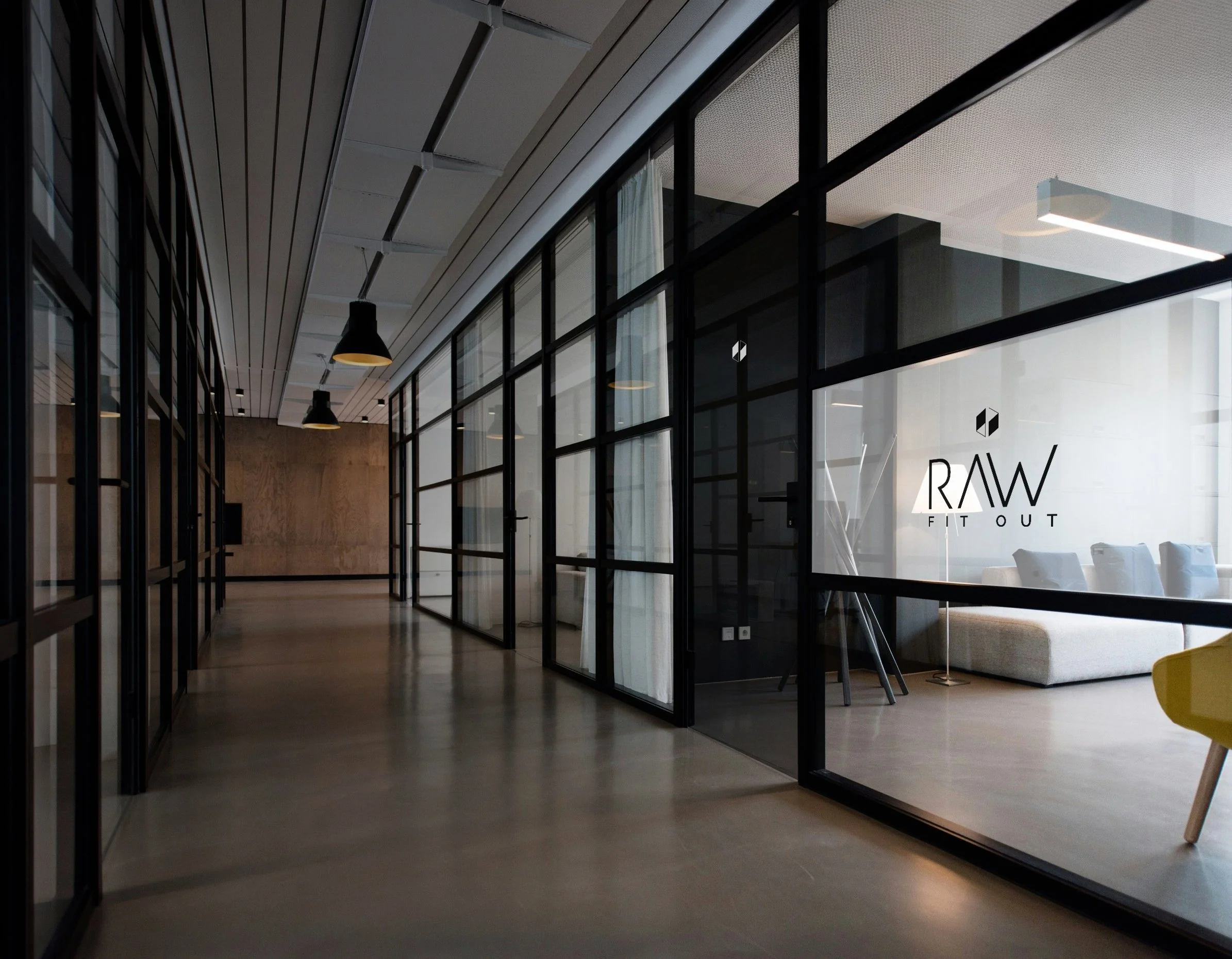
A fitting rebrand
Resource At Work approached with a simple but big brief: Modernise the RAW branding and identity.
What we did
The sky’s the limit, taking it beyond the ceilings RAW fits.
-
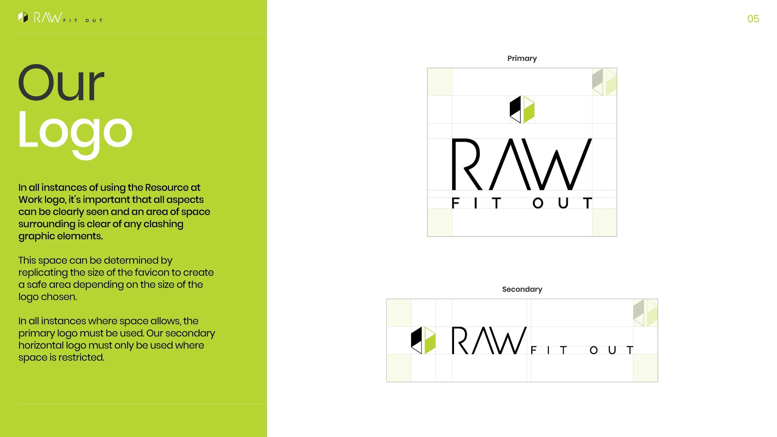
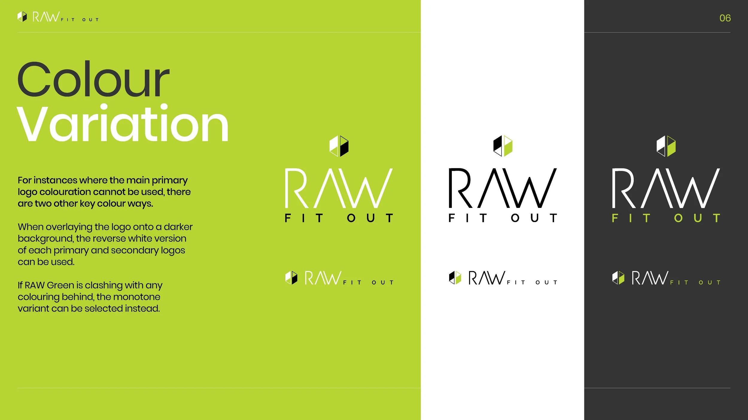
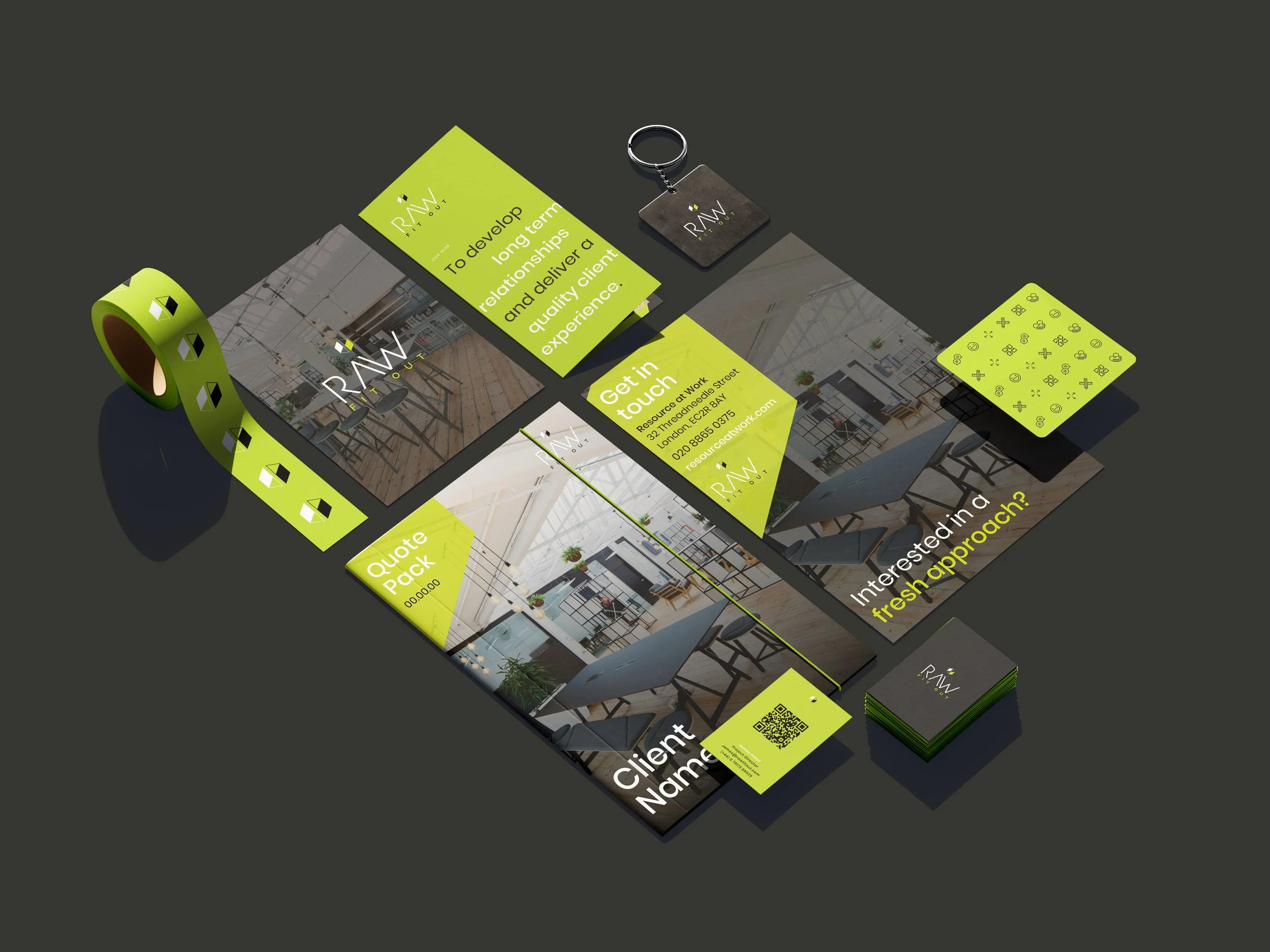
Taking RAW’s previous logo and turning into a more ‘fit’ting identity that moved their brand into the modern day.
-
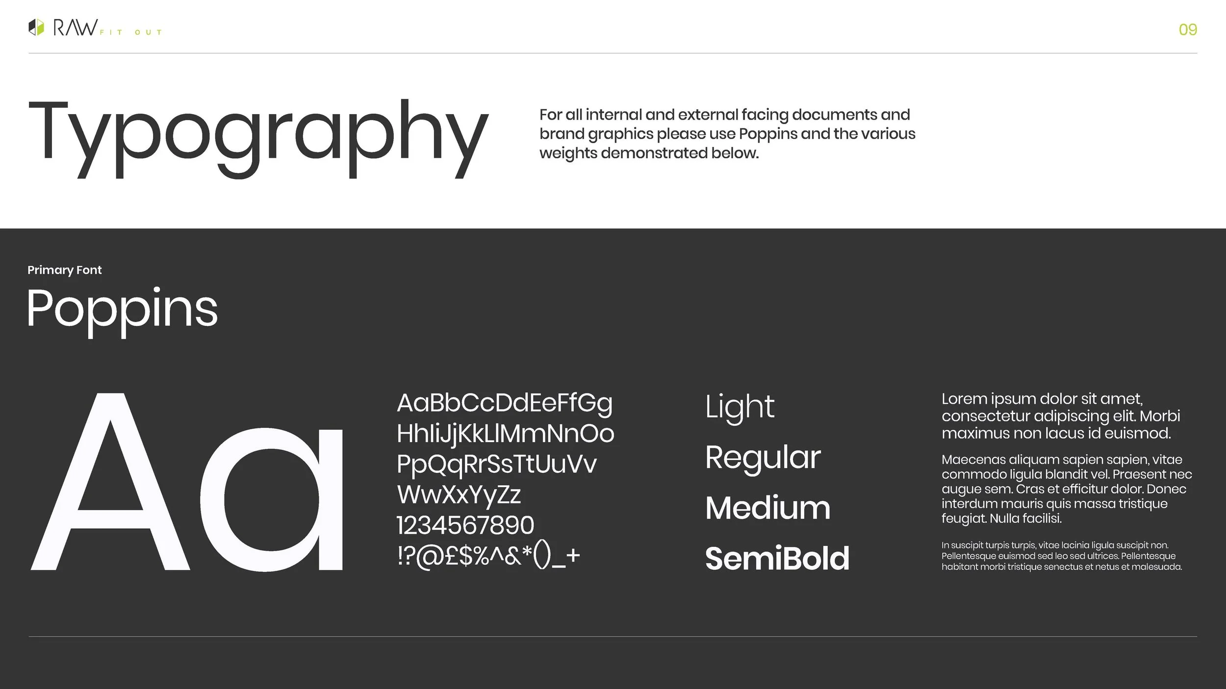
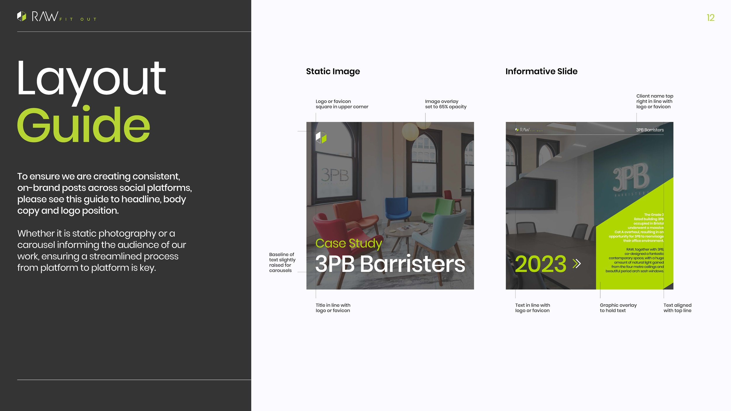
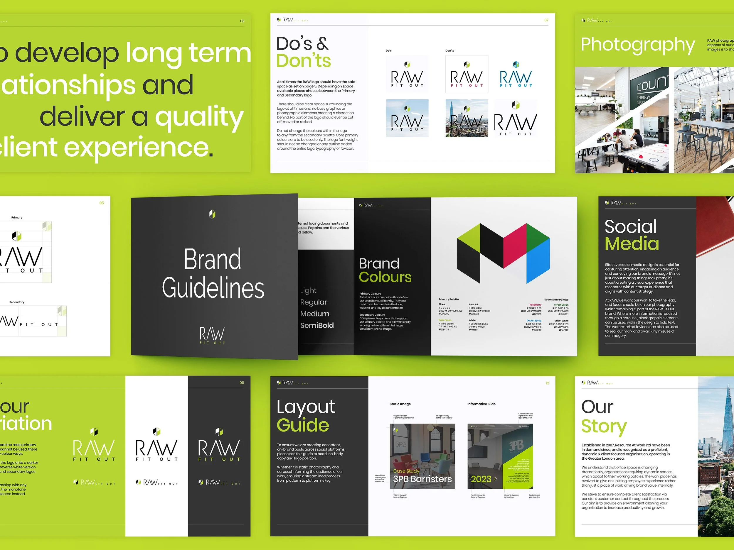
To support the new logo, we needed to establish some guides that turned RAW’s new brand into a living, breathing identity.
-
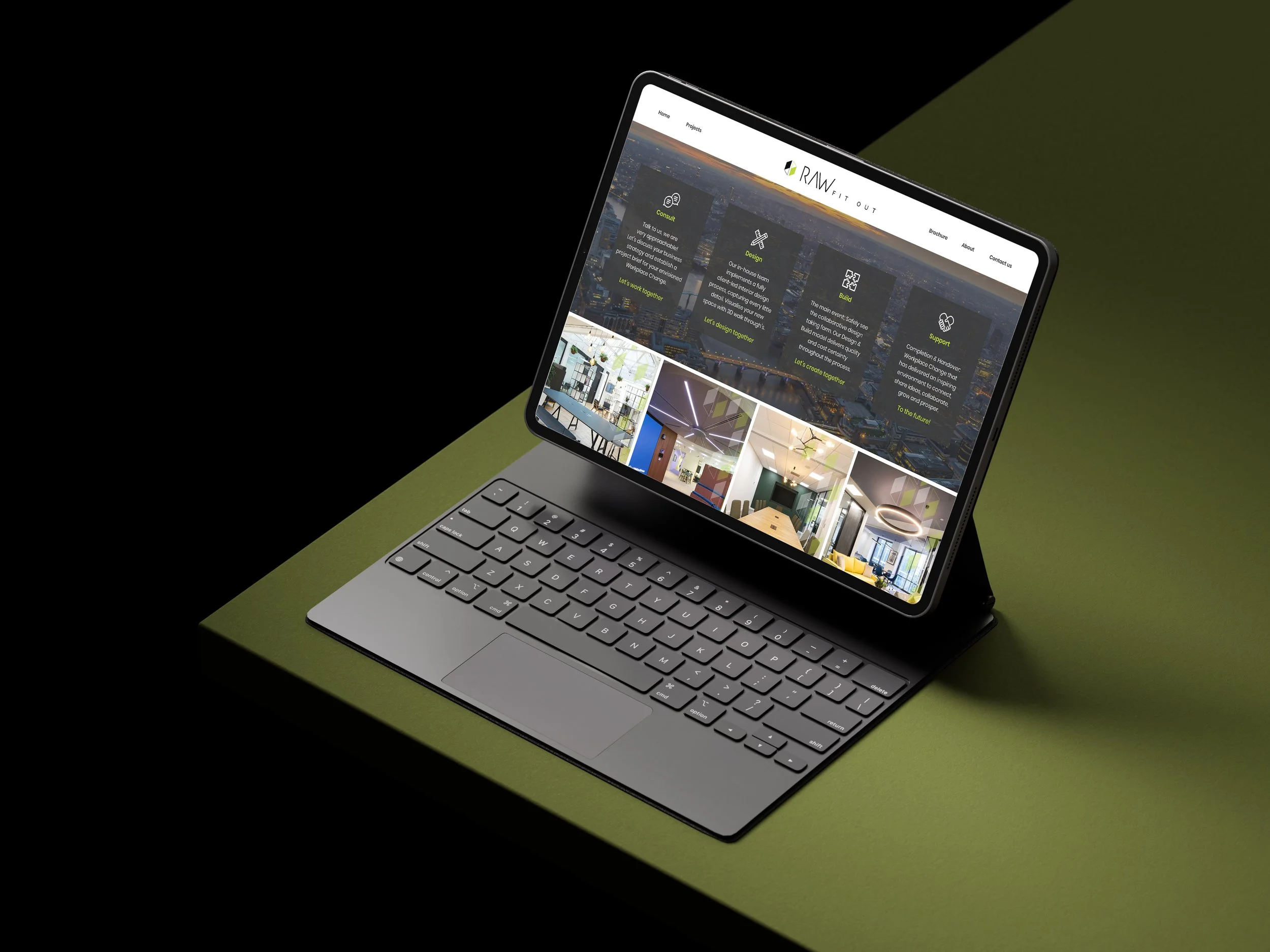
With new branding, comes a shiny new website to match. Working closely together found a new template that encapsulated that spoke with RAW Fitout’s logo and identity.
-
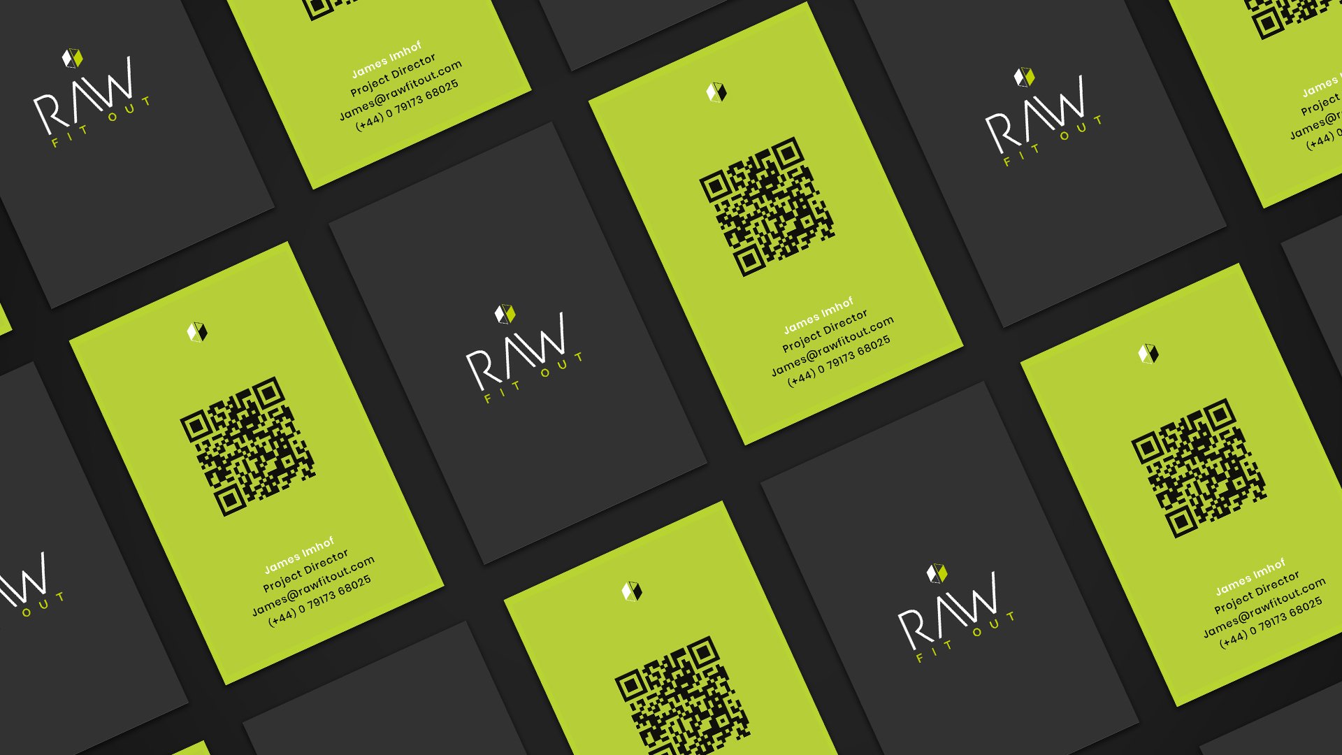
Powerpoint templates, documentation and social media templates supported the brand overhaul; no stone is left unturned.

Logo Redesign
〰️
Logo Redesign 〰️
Out with the old
In with the new
Guidelines
Branding goes further than just a logo.
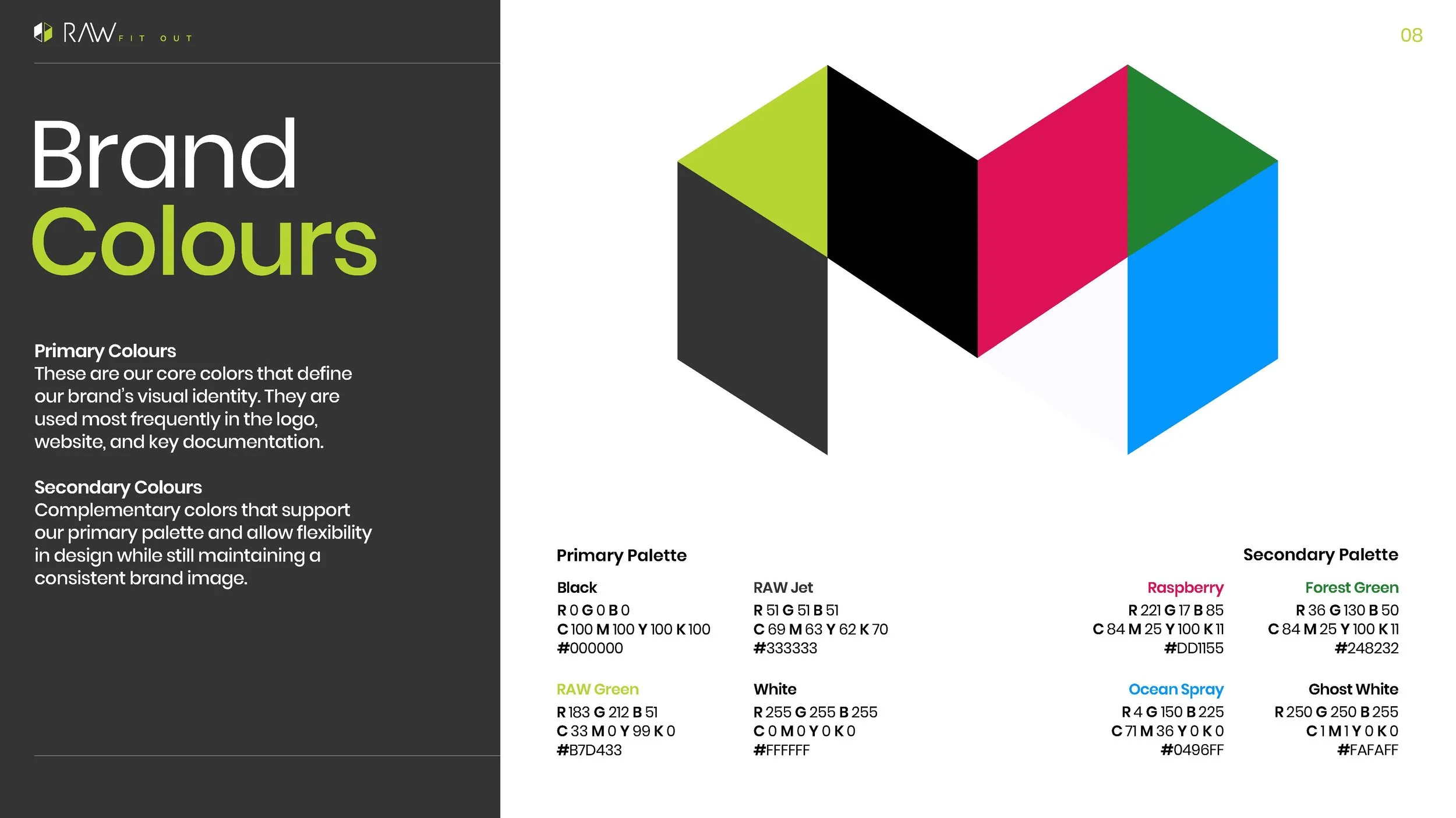
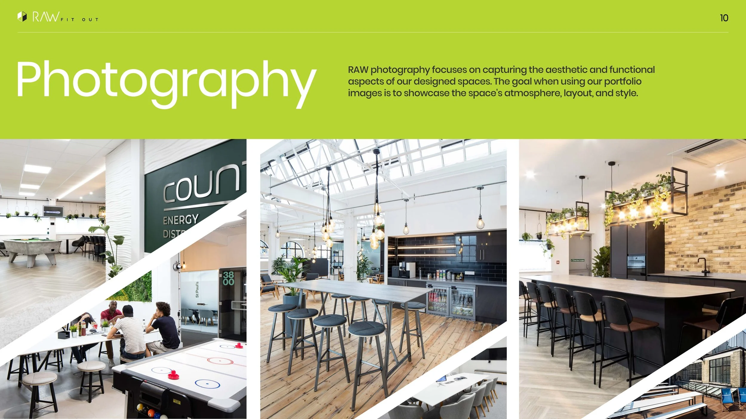
Together with RAW, we established a primary and secondary palette to compliment and contrast their existing signature logo colour way; enabling their already refreshed brand to stretch even further across a multitude of assets across their business.
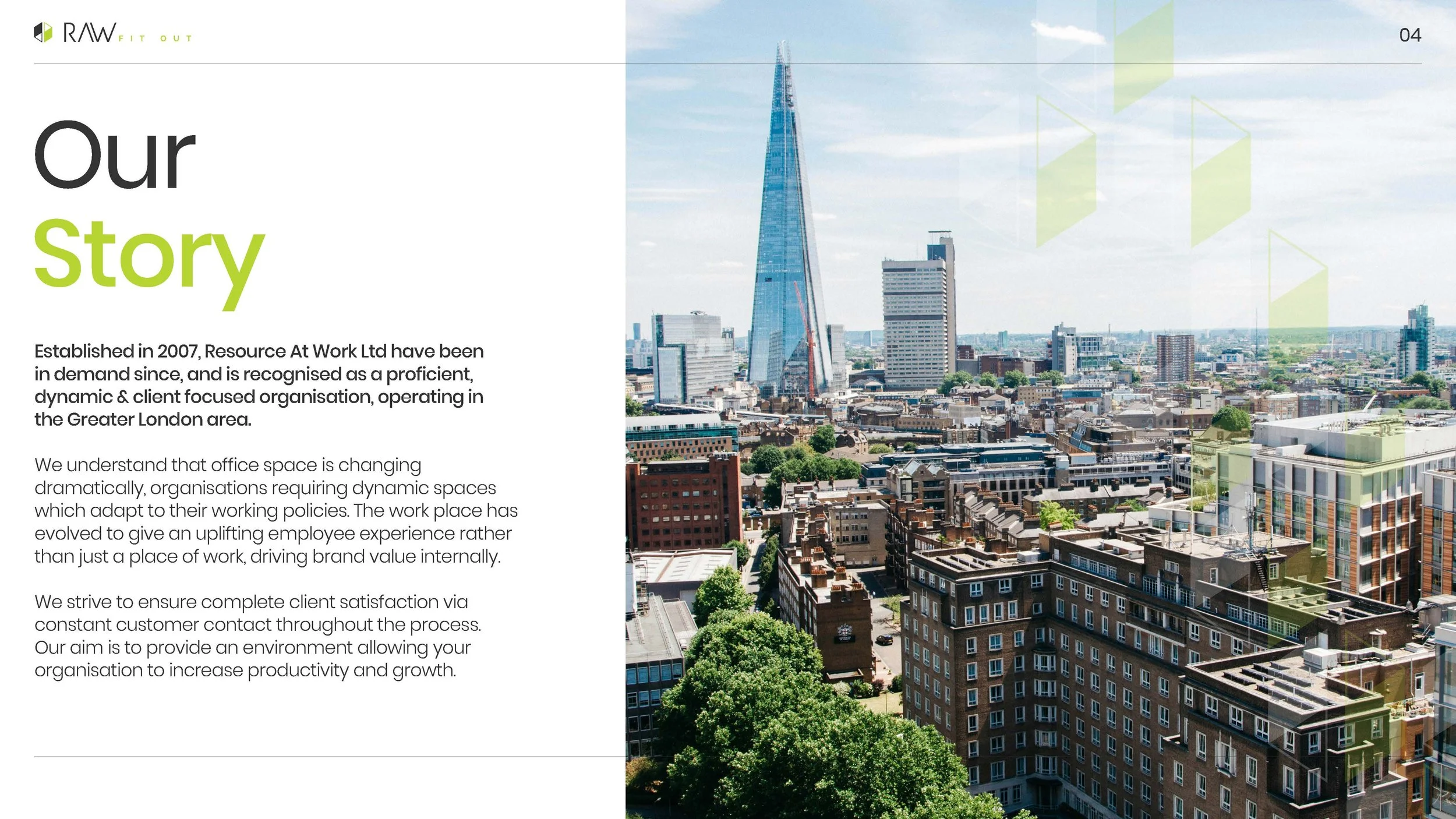
Sticking with the same MO, we reinvigorated a side to RAW that sees their brand look and voice come together as one new elevated style to reflect the standout client experience they deliver.
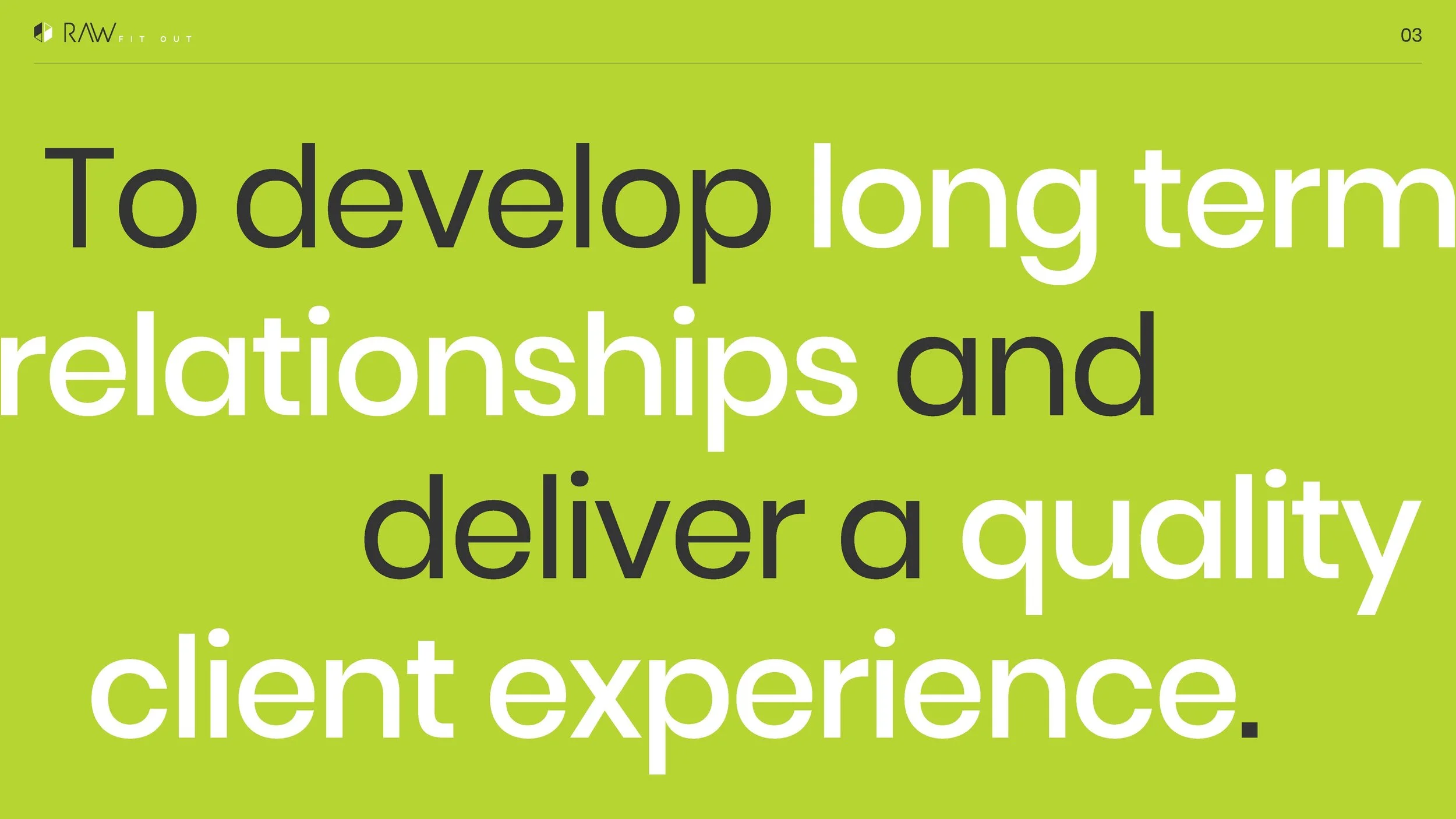
Same great ethos and signature RAW colours, but a differing refreshed brand that packs a punch and separates from the competition.
“We have had strong feedback and compliments on our new look and feel.”
Resource At Work
“A lovely person to work with, who went above and beyond the original brief to deliver an outstanding brand refresh.
Overall, 10/10 experience, would recommend to anyone.”
Let’s Work Together
Got a brand that could do with a bit more love and needs an identity that feels aligned?
Complete the form with a few details about your business. I’ll review your enquiry and aim to get back to you within 24 hours.